Charlie Kruschek: Editing My Favorite Shot of 2024
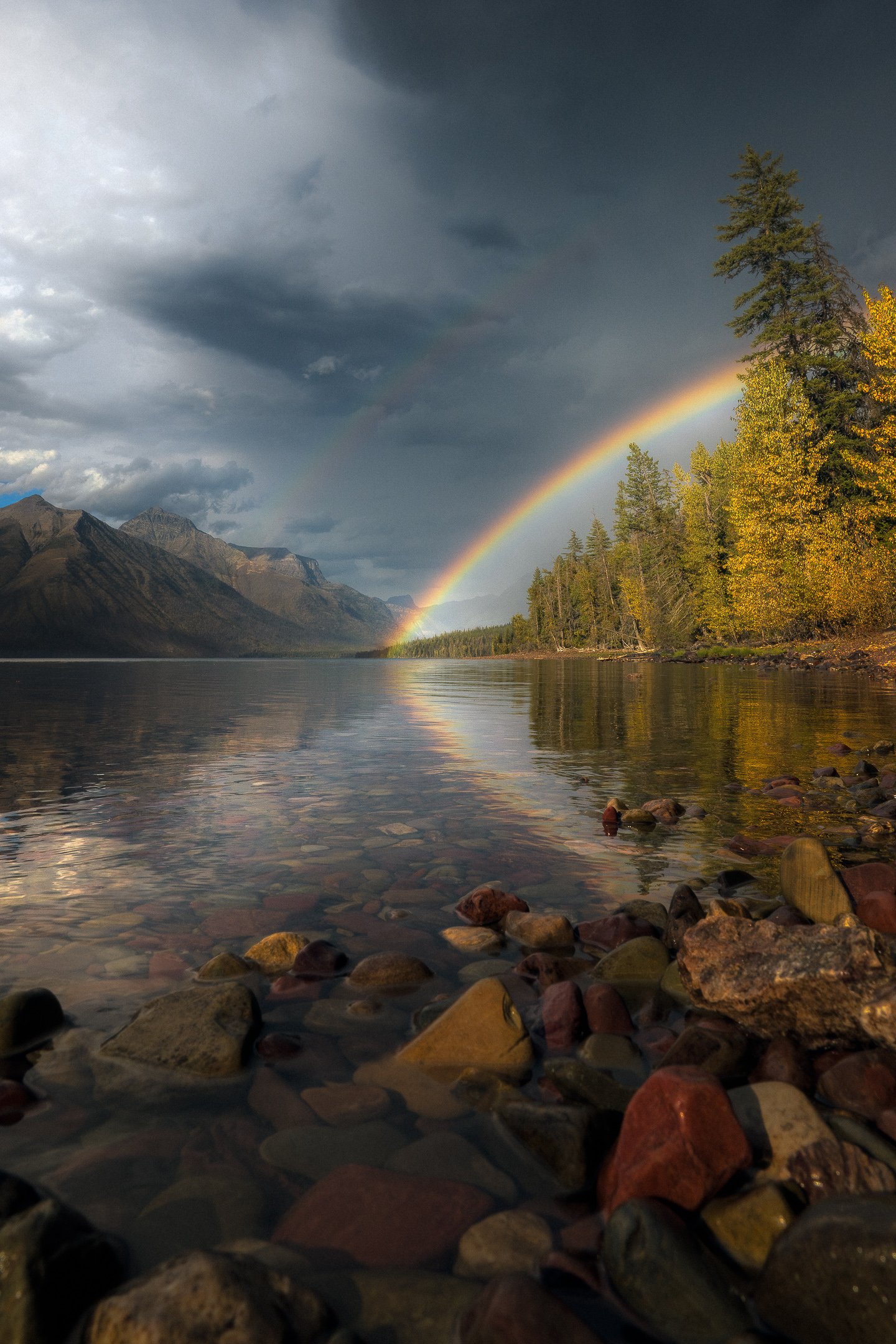
There’s something about rainbows that never, ever gets old for me. It could be the colors, the unique light, or maybe just the general way they enhance the scene I’m photographing. Regardless, these moments are some of my favorites, and back in September of this year, I captured what I proudly consider to be my favorite rainbow shot ever and my favorite shot of 2024. Let’s dive into not just the story of Ottalaus, but how I took it into post and transformed the RAW.
To set the stage, we’ll need to go back to my journey into Glacier National Park. Originally planning on heading straight up to the Sun Road, we pulled off early near Lake McDonald after I had noticed some intermittent rain showers rolling into the area. We hunted some compositions along the shoreline, and before we knew it, rain began pelting us, all while the sun was still beating down, offering some of the most incredible natural light I’ve seen all year. Once I came to my senses that, “Hey, there might be a rainbow,” I turned around and was greeted by the scene above. It was at this moment I lowered my camera, held onto my L-Bracket for a better perspective of the colorful rocks, and began shooting. I couldn’t wait to get back to the AirBnB and begin editing.
Now when it comes to editing, I try to follow a very specific workflow. Let’s take this shot and put it through that workflow, diving into some of the most valuable techniques I’ve learned in my career.
To begin, I always start and end an edit with Adobe Lightroom. There are certain images that require some help in Adobe Photoshop, but for most of what I’m looking to achieve in an image I can manage it in Lightroom. My first step always begins with cropping. In most circumstances, I’ll get a composition that I’m happy with out of camera, but occasionally, after a second look, I’ll choose a different angle or more zoomed in crop. In this case, I zoomed in a bit more than I did on-site. The tree on the righthand side that is partially cropped out felt like an eye sore. A little bit of zooming in and fixing the horizon (shooting handheld has its limitations), helped “close” off the image, as well as bring some extra emphasis to the lowered perspective I had when shooting.
Next, I went through and globally adjusted the tones and white balance of the image. I went for a slightly warmer tone while keeping contrast and shadow data relatively tame. In fact, one of the techniques that I’ve found valuable is reducing both highlights and shadows and then recovering the depth using the tone curve. I often find better results doing this method because the actual adjustments from the tone curve affect the rest of the image rather than just one part of the histogram. After doing some slight tweaks here and there, I decided it was time to move on to some color management and local adjustments.
Before I get ahead of myself, what is a local adjustment? Well, there are two types of adjustments you can make when editing. There are global adjustments, and then there are local. The difference lies in what is being affected when editing. For example, when I am editing the exposure of an image, I am globally affecting the entire image. On the contrary, if I were to apply a radial gradient as a mask, that would be considered a local adjustment because only a specific portion of the image is being affected.
Local adjustments can quickly take a photo to the next level. If you’re trying to manipulate colors or specific areas of natural light, radial, linear, and brush masks can be your best friend in creating areas of dynamic contrast, better vignetting, and my personal favorite, a more precise emphasis on your subject. In this case, I applied a series of adjustments to the sky, foreground, as well as the subject itself: the rainbow.
Once I was content with where the local adjustments had taken me, I moved onto color management. I try to save color for almost the end because I focus on natural light first, then color second. If the general tones are off with my image, then I believe color doesn’t matter. In a way, I need to earn color management. This criteria led me to focusing on not just the rainbow, but the atmosphere we had in play as well. I was able to take a mask and select just the rainbow itself, deepening the saturation and brightness.
One of my absolute favorite tools in all of Lightroom are the color grading wheels. Added within the past two years to the software, these wheels have become a staple part of my color workflow. It allows me to control the color of shadows, color of highlights, as well as the overall color of my image’s tone as well. Gone are the days of using the RGB curves to get a blue hour hue, a midday sun, or even a golden hour sunrise. Now, with the color wheels, I can make slight tweaks and find the temperature and color tone that I feel fits my images best. For Ottalous, I elected to go for cooler highlights combined with warmer shadows. Given the sunlight that hit the mountains and the trees, the warmth was inevitably baked into the shadows. As for the highlights, I added a hint of blue to not only match the color we associate clouds with, but also to honor the blue sky that still was peeking out behind the clouds themselves. What came together was a well balanced image of warmth and coolness.
From here, I focused on some of the smaller details, such as cleaning up the water, removing unwanted highlights, and applying a very, very subtle Orton Effect. For those unfamiliar with the Orton Effect, this is an editing practice in which you overlay the image with a blurred version of itself and then blend it in with the original image, creating an ethereal, soft style. One of my personal beliefs with landscape photography is that cameras can be too sharp for its own good sometimes, so a light Orton Effect and a reduction in clarity helps with bringing a more natural, earth-like appearance to the image.
I choose to keep removal of certain aspects of an image at a minimum. If I find, say, a dust spot or an object on the edge of the frame that I find distracting, I’ll remove it. At times, I’ll remove small distractions that take away from the subject, but don’t prove to be impactful to the scene. In this case, I removed the bits of debris in the water for a more balanced reflection. I did the same with the rocks by removing the highlights on the rocks. I was fortunate enough to have rotated my HGX Prime CPL Filter about halfway for this shot, so I didn’t have to worry about cutting out the reflections of the rainbow, but still getting a better view of the rocks below the scene. Once I finished these little tweaks, I finally felt the edit was done. The colors were brought out, but not inaccurately. The tones emphasized the rainbow, but still honored the natural light itself. The Orton Effect helped generate a softer image more prevalent to how we see the world, yet kept the image sharp for printing and sharing. After all that, Ottalaus became my favorite image of the year and my favorite rainbow image of all time.
Ottalaus will forever be one of my proudest images. Two years ago I had taken a step away from photography entirely, and since then, I’ve found a new love for creating and the grind that comes along with it. I’ll never take for granted the sights and scenes I’ve discovered, and I’ll always be hunting for that next great moment of natural light, no matter what. After all, translated from Icelandic, ‘ottalaus’ means ‘fearless.’ I’ll honor that.
Charlie Kruschek
Landscape photography is Charlie Kruschek's true passion, chasing everything from storms to sunrises. Standing humbled before nature's raw power and in awe of the world's subtleties, his goal is to preserve heart-skipping moments of natural light, focusing on an emphasis of time. Charlie attempts to share his imagery as a method of inspiring others to appreciate life's beauty through a different optic and the fragility of each second.
Posted December 4, 2024.


